Pages

Showing posts with label accessories. Show all posts

How predictable is your decor?

Monday, March 7, 2016

 Yes, I've been Pinteresting too much again. It's one of the best ways to see what the common trends are in interior design.  I am not talking about the "cutting edge" ones touted as design trends for a particular year, but the ones that you know average people usein their homes.  These common elements are sometimes referred to as "decorating crutches" because anyone can use them in any space.   I bet you know them already because they are constantly flying by your eyes on Pinterest or Instagram or in home decor stores.

 Check out some of the hallmarks of decor predictability in 2016  compiled from an evening of online viewing. Here are a few pics for you.   Can you see any similarities in these spaces ?


Here's what I came up with...
  • overly coordinated fabrics and accessories 
  • trays used to corral vignettes on tables
  • stacking books in vignettes 
  • pale rugs 
  • lots of  candles 
  • box store art
  • art that gives you directions (word art)
  • antlers and faux taxidermy 
  • empty frames ( is it a conceptual art statement or just a thing?)
  • dishes that match a room's colour scheme
  • accessories covering every flat surface
  • cute holiday and seasonal vignettes
  • beachy colour schemes 
  • hurricane lanterns
  • girlie chandeliers 
  •  mirrors everywhere  
  • mason jars used for every conceivable purpose
  • fake topiary
  • changing  seasonal/holiday displays 
  • gallery walls with everything apart from real art 
  • large wall clocks 
  • bleached wicker 
  • overuse of baskets for storage
  • and abundance of pillows and throws
  • gray everything
  • pale wall colours
  • family references and a touches of sentiment
How predictable is your decor in 2016?

 Is it a bad thing to be predictable?

  Probably not.

 We like what we like, and likes are developed through exposure (repeated viewing). In today's world of social media we do a lot of viewing.  Likes are also shaped by your social circles, your decorating budget, and what is  readily available in a local area.  Sometimes we want to be the same as our friends and we model each other.

We all have things we are attracted to and use in different ways in our homes. From the list of overly used elements above  I  am guilty of: stacking books as fillers and to vary heights,  using trays to corral objects in vignettes,  layering with  throws and using an antler in various arrangements (but it's a real one found on a hike) and I do have a thing about pillows.  I am happiest in light rooms and gray has been my go to neutral since 1985.  How about you?

Stay tuned for 10 ways to interject a little decor rebellion in your space.


Going Coastal

Monday, November 2, 2015

As our lives become busier and more frantic there seems to be more interest in decor styles that are calm and comfortable.  As a result coastal influences are popping up everywhere.  Perhaps coastal decor is for you.

 Check out this ideabook I just developed on Houzz. 

To see the ideabook in its entirety click on the title.  


Designing an inviting home

Monday, September 21, 2015

Have you ever gone into someone's home  and it was so perfect in every way that you were almost afraid to sit down or move?

When everything looks new, co-ordinated and just so, you end up with an unwelcoming and often boring home.   Such spaces can make visitors feel confined and uncomfortable.  Nothing invites you in because when  everything is  perfectly matched objects become a blur.

 Is there a middle road?

What makes an interesting  and inviting space? Do you need a large budget to have a great home?

Fortunately you can have a very interesting space on a modest budget.  It just takes a little ingenuity.  As with most things in home decor what someone finds interesting  or inviting is dependent on their likes and dislikes;  I can only write about what I find interesting in a space.  Here are some of the characteristics I think   create interesting spaces.

It has a collected feel

That simply means that the home has objects that have been acquired over time and in different ways.   It could be objects collected from travels, antiques, personal items,  family heirlooms, original art etc.  The space does not look like you went out to several stores on one day and outfitted the place. It definitely does not look like a model home!


The rooms are arranged for conversation

Nothing is as bad as going to someone's home and not feeling like you are meant to be there.  You can have that feeling for many reasons, but  it often boils down to not feeling part of the conversation or not having a comfortable place to sit or lay down a beverage.


I would love to spend an evening here chatting with friends.


There's a mix of old and new

Pristine is not that interesting.  Often when everything is new you don't appreciate any of it.  You need a yardstick against which you can appreciate the newness, and that means having some things that are older.  Another great thing about  old pieces is the sense of history and intrigue they create.  Visitors are left wondering why the pieces are so important that you've decided to keep them.  If you like very contemporary or modern decor, there is still a place to add interesting objects with a history.

Briggs and Solomon 

There's a mix of hand crafted and manufactured products 

In our world of mass production, it is so easy to forget the importance of the marks left by the hands of an artist and the presence of ideas in objects.  Having  art, fine craft and the hand made is like having a whole pile of interesting people over at one time.  There is a merging of ideas and various takes on the natural and man made world. Then there's the one of a kind aspect.

Designing Home/Margaret Ryall

Everything in this space is hand made by various artists.   Even the plant was grown locally.


The natural world is referenced  

Designing Home/Margaret Ryall


This unique vessel titled Barnacle by Anita Singh plays nicely with the glass bowl of sea urchins and wild ferns.  The nautilus design on the pillow supports the overall outdoorsy theme in this casual summer house.  The table in the photo above can be seen in the background. 


 Accessories are moved/changed 


Designing Home/Margaret Ryall


Another week and a different  wild flower arrangement  and vessel by Anita Singh on the little  hand painted table.  The objects and flowers add colour, texture and variety in forms to the vignette.  A painting by a local artist peeks out behind the chair, something new to be discovered.  Candles are always inviting. 


Thought has been given to space planning 


The room is arranged as well as it can be given the space available.  The layout is conducive to flow through the space.  There is an obvious visual flow as well as  defined traffic lanes.  There's variety in heights of objects and  textures. Even a monochromatic colour scheme needs contrast.


There are surprises to be discovered

I love a bit of the unexpected.   There are all kinds of ways to achieve this.  It could be a colour that you might not think about pairing with your colour scheme.  It could be an a family heirloom, some of your child's artwork scanned and made into a book, a vase you made in high school art, the work of a friend,  a display of framed post cards from trips you've taken arranged in a grid, a piece of furniture in a place where you wouldn't expect to see it, etc.  The sky is the limit.


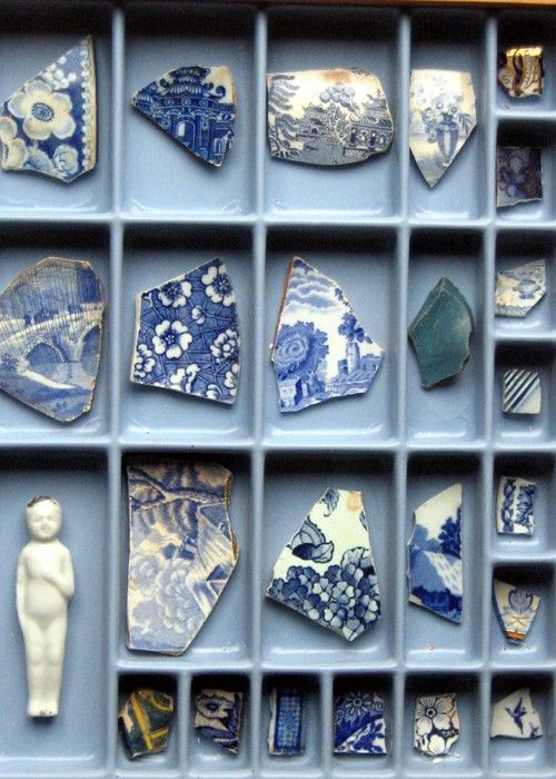
How pleasant these doilies look backed with blue and enclosed with white frames .  Such a great way to display family heirlooms.


 I am intrigued by the chain hanging from the candlestick.  Does it have significance to the homeowner? Did a visitor drop it and it's placed here to keep it safe?  Did the homeowner change her mind just before going out?


 Each piece has its own compartment that acts like a mini frame.  Together there is coherency in the pieces and it is very pleasing to the eye.  My favourite is the white doll.  Where did that come from?


And why not end with glowing forsythia, bold in scale and vivid in colour? The arrangement look so great in front of a simple, repetitive composition of fish. 

What tricks do you use to create an inviting home?

Arranging vignettes: Do you know your design letters?

Thursday, July 16, 2015


 Are you challenged when it comes to arranging  accessories? Do you look at details in  decorating magazines and marvel at how everything  looks just right? Many people think the final touches are the most difficult part of home decor, but they don't have to be.  There are all kinds of tips and tricks of the trade. 

One of the simplest design tips I can offer is the use  of  letter formations to organize interesting accessory vignettes. I'm calling on my background in visual art and floral arrangement to offer you this advice.  Other decorators may have different ways of describing their approach. 

The most useful letters for designing vignettes are ....  A, V,  O, C, L, and M.  

Here goes...

A


eclectic bedroom traditional bedroom bedroom vignette


This is a very tight A line of design.  The visual height is always through the middle and the base is wider, but the bottom width can vary.  My eye wants to see something slightly taller than the dish - a sphere  would be lovely here. Perhaps the owner is like me,  always looking for just the right object to finish a room.


vignette, black and white, A line of design

source

Another A with a tall vertical.  Because this is a monochromatic scheme the overall A shape is more evident.  Are you noticing how the height is usually a piece of art?  It  could also be a sculpture, a mirror,  a  tall vase of twigs or flowers or photos hung on the wall.  The base can also  be much wider and the height much less than these examples. 


console table, vignette, V line of design
 
The reverse of A is V. In a V the lowest point is usually in the middle of the arrangement.  Sometimes thinking about it as a check mark is helpful because one side is usually taller and one is shorter.  A V line of design doesn't  have the height through the middle that an A line of design does. Sometimes only these two shapes are presented in vignette discussions, but there are so many more ways to think about it.  


C


Quintessential Dressing Table eclectic bedroom
 Lucid Interior Design Inc.

vignette, console table, C line of design


source 

 You don't often find C lines of design and they are the most obvious when there's only one object banked by something that is circular as with the mirror and twigs.  Your eye just wants to make that sweep.  But sometimes it is the placement of objects that creates a C sweep with the largest object placed at the beginning of the C as in the photo above. 


 o
Joni Spear Interior Design contemporary dining room, vignette
 Joni Spear Interior Design

 Some designers may argue this is a classic V formation but I would disagree because the mirror causes the eye to move in a circular fashion around the display.  The lamps are taken in with that sweep.

 Wakefield Residence modern living room, vignette, console table
 Rachel Reider Interiors

 Another  symmetrical O line of design.  The base is set so broadly that your eye just wants to do the circular movement around the objects. The three rounded shapes  add to the circular movement.  


vignette, starburst mirror, o line of design

Another very strong O line of design.  It is even more obvious when you have a narrow base. 


Metal decor modern living room, console table vignette
  CNW PRODUCTION

Urrutia Design contemporary , console table
Urrutia Design


The requirement for an L line of design is a very tall object placed on the edge of the design with a broad base.  Of course you can also reverse the L.  If the hurricanes were taller I would call the  vignette above a V. 


M


You don't often see the M line of design used, but it works well when you are displaying collections where you have several heights with dips in the middle and you start with shorter objects on the ends.  


traditional mantle vignette

source 

console table vignette blue lamps


If the shorter objects are on either end it is an M, but when you start with taller objects on the ends and it is also high in the middle  it moves into a W.  


What line of design do these vignettes follow? 

1.


2.


3.


1.This is  an A because of the wide base and the tall height through the middle. 

2.  Whenever you see a  lot of objects of similar heights spread out and starting and ending with a shorter object it is an M.  The more objects there are it can turn into a long zig zag of Ms. 

3.  Oh so tricky.  Without the curved object to the right it would be an O line of design, but your eye stops on it making it  a C. 

 
And there you have it.   Keep your eyes open when you see arrangements and observe the  lines of design  used. Then start arranging! 


Most Reading